UKC

Andy Turner on 'The Cathedral' - image A vs. B

New Topic
This topic has been archived, and won't accept reply postings.
LukaszWarzecha 18 Feb 2011
I would like to know your opinion... Follow the link to view both images and my short explanation:
http://blog.lwimages.co.uk/

Best,
Lukasz
 mattrm 18 Feb 2011
In reply to LukaszWarzecha:

B as you can see the rest of the world (context) of the shot. A looks like most of my photos, i.e. the background is all washed out. I'm a total non-photographer tho, that's just my opinion.
 Monk 18 Feb 2011
In reply to LukaszWarzecha:

Definitely B for me. It show's the situation, whereas A could be a hole in the cliff anywhere in the world. (Plus, I like blue skies.)
chris05 18 Feb 2011
In reply to LukaszWarzecha:

I much prefer A, it looks more natural.
 Blue Straggler 18 Feb 2011
In reply to LukaszWarzecha:

B, for various reasons including that he doesn't look asleep in it

Unfortunately both images look like he is hanging on the rope. I realise that he probably isn't and this is just the nature of climbing out of a cave, but there is less "drama" than there should be on something hard like this. Nothing you can do about that apart from make him solo it or run it out though
 chrisbaggy 18 Feb 2011
In reply to LukaszWarzecha: A could be a small cave anywhere.

B in my opinion is better as it gives it more context although it looks more set up (Which it is due to the forelighting preventing washout of the background) I feel it sells the route more
 casa 18 Feb 2011
In reply to LukaszWarzecha: A for me, the climber appears sharper
 tom290483 18 Feb 2011
In reply to LukaszWarzecha:

i like B. the colours look good and mr turner looks a bit more 'in the moment' on the climb. in A he looks a bit too easy.

good work lukasz!
 Fraser 18 Feb 2011
In reply to LukaszWarzecha:

It's 'B' for me - 'A' looks a bit desaturated and less clear.
 JH74 18 Feb 2011
In reply to LukaszWarzecha: B's a winner!
 robal 18 Feb 2011
In reply to LukaszWarzecha: its b for me!
 fionn 18 Feb 2011
In reply to LukaszWarzecha:

A ... it's more natural.

 Russell Lovett 18 Feb 2011
In reply to LukaszWarzecha: B for me, why do you need to ask, B is a much better photo by a long way.
 Milesy 18 Feb 2011
In reply to Russell Lovett:

B - Because I can immediately recognise Ben Lomond and put context to the picture.
 neil the weak 18 Feb 2011
In reply to LukaszWarzecha: B, by miles. "A" just looks blown and lacks drama. Sure, Image B is more obviously staged / tweaked but just way, way stronger.
 jas wood 18 Feb 2011
In reply to LukaszWarzecha: B bacause i don't like the balance or the lack of background in pic A (personally) whereas B has a lot more going on in the composition and offers more of a "feel" for the position.
 another_mark 18 Feb 2011
In reply to LukaszWarzecha:

B.

But, the bottom of A (view out of the cave below the climber) is better in that the snow is white and still retains contrast.

if you'd used an ND grad might you have been able to produce an image which was mostly B but without the shadow background?
 jamestheyip 18 Feb 2011
In reply to LukaszWarzecha:

B is a more eye catching image and give more information about the context. However I personally prefer A. It looks less staged and is more truthful about the atmosphere of the place. I quite like the fact that his face is shaded. Looks like he is making a committing move to climb out of darkness.

Perhaps with a bit of dodging and burning with image A, the climber can be shown a bit brighter and more contrasty while the horizon can also be revealed.
Tom Knowles 19 Feb 2011
Hi Lukasz,

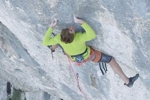
I'm pleased you posted this thread because when I first saw image B in Climber I thought it was one of the worst climbing photographs I'd ever seen. Sorry for being so blunt, but it doesn't surprise me at all to hear that it was a staged shoot, as that's exactly how it appears, especially so in image B. More specifically, in B the cave looks like some sort of artificial grotto, the bright red of Andy's jacket is sickly sweet, and the pro clutters the top of the shot.

A is a far better image in my opinion, much more "Scottish" in appearance. You can feel the cold of winter in A, and the white background contrasts well with the grey cave.

However, in both images, there is a very obvious lack of exertion or focus on the part of Andy, so much so that I initially thought he had his full weight on the rope. In that respect, the image would perhaps have looked livelier with both of Andy's feet on the rock.

You mentioned Cubby's image of MacLeod on the route; sorry again, but for me, Cubby's shot is in an entirely different class - natural, aesthetic and compelling.

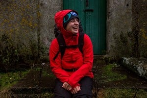
By the way, I'd like to add that I don't feel this way about all your shots! Your recent "Scottish Winter Season" images are excellent - the portrait of North-East Buttress, for example, is one of the most atmospheric I've come across (and I've seen a LOT from that angle!). And the one taken in the car showing the dashboard and open road really captures "the drive north" - in fact, I actually lost myself for a minute or two in that photo!

It's interesting, of course, that on a commercial level at least, the quality of your shot of Andy is largely irrelevant. It captures an important ascent, and that in itself will always make it more commercially viable than an image which may be superior in quality and composition, but is deemed to be of little worth to a large audience.

PS. Here's a few images that are personal favourites, each of them very atmospheric, very "Scottish" and very natural

Greg Boswell on The Duel:

http://www.scottishwinter.com/?p=1200

Guy Robertson on Stone Temple Pilots:

http://www.scottishwinter.com/?p=1512

Pete Benson on Centurion:

http://www.flickr.com/photos/13258108@N04/2244240322/in/photostream/lightbo...
LukaszWarzecha 19 Feb 2011
Thank you for all your comments. Fantastic feedback! Like to hear your opinions.
I will try to post a discussion round up and maybe explain some technical details on my blog tomorrow.
 Sean Bell 19 Feb 2011
In reply to LukaszWarzecha:

Hi Lukasz

Im swaying towards image A. Although Im a big fan of the lighting technique you haved used in B it just feels like a commercial shot rather than an image of a gnarly first ascent. Im also however, thinking that maybe I feel like this because most of these types of shot have so far been snaps or at least shot using only available light so perhaps our brains are not used to seeing such a slick set up adopted for gnarly real life winter leads in the mountains, which adds up to the slightly unreal look , Even though we know its for real.My only feedback is that possibly the flash could have been 'snooted' to exclude the light on the upper rock, or possibly knocked down 1/2 stop and shutter opened up so the climber would sit in more with the ambient to create less of a gap in the FL/AMB ratio(?)and be more fill-in than flash heavy.Its a hard one to call mate, its technically good, almost too good. So somewhere in between A and B ? But I can understand A being used for certain editorial pieces.

All that said, I religiously follow your work and Im always impressed, envious and inspired, keep bringing us those special images and putting us all to shame/keeping us on our toes.

All the best

Sean

LukaszWarzecha 21 Feb 2011
Once again, thank you for all your votes and opinions...
I have just posted a discussion round-up on my blog http://blog.lwimages.co.uk/ with some technical details also throwing a curved ball your direction... image C.

Best,
Lukasz
 The Pylon King 21 Feb 2011
In reply to LukaszWarzecha:

the test frame c is the best
 Mike-W-99 21 Feb 2011
In reply to LukaszWarzecha:
C is a nice concept but the background highlights are a bit over exposed.
Tom Knowles 21 Feb 2011
In reply to LukaszWarzecha:

Hi Lukasz,

Have just looked at image C and my instant reaction was "WOW"! What a difference! I think it's super sharp, the axe and the snow set the scene, and Andy now appears to be far more dynamic (probably because his facial expression of before is now hidden). Furthermore, I feel like I'm in the cave watching this. For me, image C is certainly deserving of full-page magazine status.

Well done, very impressed!
 Henry Iddon 23 Feb 2011
In reply to Russell Lovett:
> (In reply to LukaszWarzecha) why do you need to ask

Self promotion and seeding links I'd imagine. Its all part of it these days.

New Topic
This topic has been archived, and won't accept reply postings.
Loading Notifications...