
This topic has been archived, and won't accept reply postings.
Has anybody else noticed the highly confusing technical jiggery pokery, that has happened on the front cover of the latest (october) issue of Climber magazine?
Look at the left hand arete of the corner that the bloke is in.
Follow it up to about 1 cm underneath the 'li' of Climber.
I'm confused.
Look at the left hand arete of the corner that the bloke is in.
Follow it up to about 1 cm underneath the 'li' of Climber.
I'm confused.
In reply to Alex Purser: I couldn't figure it either. Thought it was just me being thick!
In reply to Alex Purser:
Must have been one hell of a chipper to get that much rock so square.
I wonder what the original looks like without the jiggerypokery done to the rockface, it looks like all that LH face has been extended for effect.
Must have been one hell of a chipper to get that much rock so square.
I wonder what the original looks like without the jiggerypokery done to the rockface, it looks like all that LH face has been extended for effect.
In reply to sutty: Sorry boys and girls, i know conspiracy theories about magazines are one of the things that keeps RT ticking over. But I suspect the front cover of Climber is unmanipulated. For those who have a copy of the latest Rock and Ice turn to page 63, where there is a slightly wider view of the same shot. The line of the lower arete continues up a small vertical seam for about 6ft (most of this is hidden behind the m in the climber title) and is a fracture line. And yes the rock is as right angled as that. Sometimes life is indeed stranger than fiction.
In reply to Ian Parnell: Dunno, looks odd to me, not just the right angled thing but also the detail of rock surface, hmmmmmm etc...
In reply to Ian Parnell:
I'm going to agree with the flying giraffe.
It definately does not look right.
By any stretch of the imagination.
I'm going to agree with the flying giraffe.
It definately does not look right.
By any stretch of the imagination.
In reply to Alex Purser:
I think I stand corrected.
http://www.onsight.com.au/home.htm
But it still doesn't look right on the cover.
I think I stand corrected.
http://www.onsight.com.au/home.htm
But it still doesn't look right on the cover.
In reply to Alex Purser: Yep, strange stuff indeed, but seeing those photos, it must be natural.
In reply to Alex Purser: i was just looking at it a min ago having a shite. came here to post and got beat to it. gotta be doctored, got to be.
In reply to Alex Purser: i rekon it's been photoshopped!
In reply to Alex Purser: a wee bit.
with the right software you can do anything - as i think has been shown on said magazine. look no belayer too!
with the right software you can do anything - as i think has been shown on said magazine. look no belayer too!
In reply to harryP: belayer bit is explained in that link
In reply to Anonymous:
Would anyone care to explain what we are meant to be looking at? I don't have the current edition of Climber, and nice though the piccies in the given linke are, I don't know which one is under discussion.
Bob
Would anyone care to explain what we are meant to be looking at? I don't have the current edition of Climber, and nice though the piccies in the given linke are, I don't know which one is under discussion.
Bob
In reply to Anonymous: oh is it the speed climbing thingy?
In reply to Bob: not really. go and buy it tomorrow ;0)
In reply to Bob:
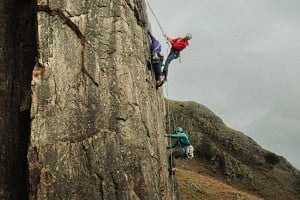
Zodiac pitch 14
The guy laybacking the huge flake. Red rope coiled on the ledge about 30 feet below.
The nearly right angled chunk above and left of the climber, is the one in question.
Zodiac pitch 14
The guy laybacking the huge flake. Red rope coiled on the ledge about 30 feet below.
The nearly right angled chunk above and left of the climber, is the one in question.
In reply to Alex Purser:
Does this have to be doctored? Why couldn't it be a marvel of nature? Giant's Causeway - perfect hexagons, how did the Irish do it?! Cynical tourism boostin ploy if you ask me. Anyway, even if it has been tampered with, what's the problem, and who cares?
Does this have to be doctored? Why couldn't it be a marvel of nature? Giant's Causeway - perfect hexagons, how did the Irish do it?! Cynical tourism boostin ploy if you ask me. Anyway, even if it has been tampered with, what's the problem, and who cares?
In reply to Alex Purser: did anyone ask the photographer?
In reply to Alex Purser: keep me informed.
In reply to Alex Purser: I think you've been eating too much cheese. It's certainly an unusual formation but nothing to provoke conspiracy theories. Assuming it's the right angled block in this picture http://www.onsight.com.au/gallery/features/zodiac/index.htm that you're talking about.
In reply to Jonathan T:
On the contrary, I think the image in the gallery you refer confirms that the Climber cover picture has been subtly doctored. Both images are clearly taken from exactly the same camera position, just a few seconds apart, judging by Huber's hand positions, yet the arete below the left hand side of the letter M of Climber does not look the same at all. The orange streak left of the arete is missing, and the darker grey rock comes from an area a bit further left in the website image. I think the image has been narrowed to make it fit the format of the Climber magazine cover.
The rock texture and cleanness of the arete is another give away, especially at the top.
I say this as someone who has done a lot of Photoshop work.
In reply to Gordon Stainforth: Ah ha, I assumed they were one and the same picture, having not seen the climber cover.
In reply to Gordon Stainforth:
I have printed it out, set it as background to get the largest possible image and concur that there has been a bit of modification to the picture to suit the Climber title.
The orange streak left of the arete is missing, and the light curved quartzlike vein does not meet the arete in the correct place.
Having said all this the modification does not take much away from the picture, it is still a great picture. The one of him topping out with no runners on pitch 13 made me wonder how many times they had done it with gradually reducing runners till they were virtually soloing the route.
Now if some nerd had not pointed out the mod I would never have seen those other pictures, thanks trainspotter
In reply to Alex Purser:
Sorry, could not remember who posted first. You HAVE to be a bit keen on detail to notice it though, hence trainspotter;-0
Sorry, could not remember who posted first. You HAVE to be a bit keen on detail to notice it though, hence trainspotter;-0
In reply to Alex Purser: Still not convinced. There are 3 images that should be looked at: the one on Simon's web site, the Climber cover and the one in the latest Rock and Ice. All are slightly different (that motor drive must have been steaming!)The shape of the square cut arete is the same on all of them, but the background is different - basically how much of the North America Wall is shown. Simons website has the most shown complete with yellow streak, then the Climber cover with the Rock and Ice even less is shown. Of course this could have been both Climber and Rock and Ice using photoshop (with the join down the whole arete) but much more likely I think is that it's the slight movement hanging on an ab rope. This will have no affect with something close but even 1 cm movement would have a significant affect for something 500m away i.e. that back wall. Also the cover of Climber is a crop so if you wanted to keep the figure in the same position on the page then they could have used a slightly larger image - a lot less hassle without the worry of a dodgy photoshop job being debated on RT!
In reply to sutty:
I'm not a complete anorak, studying every inch of each photo that I see.
It just jumped out at me when I first saw it.
Honest!
I'm not a complete anorak, studying every inch of each photo that I see.
It just jumped out at me when I first saw it.
Honest!
In reply to Alex Purser: Just checked with Bernard the editor. As expected the image is as the slide (original) is with absolutely no manipulation. This is an interesting debate as with the increasing use and abuse of digital manipulation there is an element of distrust now of images. I would like to think we can still return to a time when we can still be in awe of what nature can create. Yes that arete is as sharp as that. El Cap is full of equally amazing features.
Hope that answers peoples doubts.
Hope that answers peoples doubts.
In reply to Ian Parnell: not having it.its wrong
In reply to Ian Parnell: if it had been PS work then it would have been very poor PS work...no-one doctoring an image should leave something so obviously 'wrong' thus tempting the viewer to search the pic for more errors...digital manipulating only works if the viewer doesn't know it's been done...having said that I'd never doctor a 'news' pic but for my more arty pics then (almost) anything goes...
In reply to Gordon Stainforth:
'Your reply has been successfully posted'! But nothing happened.
OK, here it is pasted below:
In reply to Ian Parnell:
'Your reply has been successfully posted'! But nothing happened.
OK, here it is pasted below:
In reply to Ian Parnell:
In reply to Gordon Stainforth:
The shape of the square cut arete is approx the same. But it looks much cleaner again than in the other two images.
No - 1 cm difference will not have that affect on something 500 m away, sorry. Even one meter, if he could have leant out that much further. But foreground perspective looks identical.
No, depends what they wanted to do. I believe they would have wanted to do exactly what I would have wanted to do - keep both the extreme L and R parts of the image as they are. And that's what they've done.
I'm going to speak to Bernard about this now! Or tomorrow am, as it's getting quite late.
> Rock and Ice. All are slightly different (that motor drive must have been steaming!)The shape of the square cut arete is the same on all of them, but the background is different - basically how much of the North America Wall is shown.
The shape of the square cut arete is approx the same. But it looks much cleaner again than in the other two images.
> Simons website has the most shown complete with yellow streak, then the Climber cover with the Rock and Ice even less is shown. Of course this could have been both Climber and Rock and Ice using photoshop (with the join down the whole arete) but much more likely I think is that it's the slight movement hanging on an ab rope. This will have no affect with something close but even 1 cm movement would have a significant affect for something 500m away i.e. that back wall.
No - 1 cm difference will not have that affect on something 500 m away, sorry. Even one meter, if he could have leant out that much further. But foreground perspective looks identical.
> Also the cover of Climber is a crop so if you wanted to keep the figure in the same position on the page then they could have used a slightly larger image - a lot less hassle without the worry of a dodgy photoshop job being debated on RT!
No, depends what they wanted to do. I believe they would have wanted to do exactly what I would have wanted to do - keep both the extreme L and R parts of the image as they are. And that's what they've done.
I'm going to speak to Bernard about this now! Or tomorrow am, as it's getting quite late.
In reply to Gordon Stainforth:
something very spooky there. Went on third attempt. Did nothing different.
something very spooky there. Went on third attempt. Did nothing different.
In reply to Gordon Stainforth:
If you look closely at where the light streak is where the straight line of the hanging flake starts when I place a straight edge on the original there is no straight line, it is not far off but it is not as if cut by a saw.
As I said before, it does not detract much from the picture but it is there.
In reply to sutty: Just logged on having been hard at work on a bloody sunday. Youre a funny lot you are. I've asked the editor and got an answer what more do you want?
Ask yourself why would Climber bother doing this? They pay £100 to the photographer, the budget of the whole mag is minimal so why would they spend time faffing with something unless it was crucially important to the set up of the cover?? Which it quite patently isn't read previous post about crop etc.
Sutty if you are comparing using the image off Simons web site then its a useless comparison, the scan isn't high enough quality
Have any of you bothered to look at alternative evidence such as the suggested Rock and Ice image?
Those who have will be able to follow the granite crystals and micro features in the arete and match them inch by inch between the rock and ice image and the climber image. So if there has been any change in the arete it has been done either by both editors on opposite sides of the globe to exactly the same specifications without telling each other. Or the image has been alterred by Simon and then a transparency made. This he will have done on at least 3 different images (in the sequence) with different effects (Ask yourself again why he would bother doing this?)
Gordon don't know how you can say moving the camera position wouldn't have an affect. Just swaying slightly (its pretty late) and looking at my monitor the perspective of my monitor stays indistinguishably the same while the wall behind (2feet) changes radically. Magnify this by at least 500m difference and you will get a massive change.
I'm off early away to work and probably won't get to a computer so I'll leave it to the conspiracy theorists.
One for the X Files Eh?
In reply to sutty:
Yes, it's now as if cut by a razorblade. Not quite like the original.
The picture still looks great. Not the issue. But it is unnerving, because we know we are looking at some kind of peculiar montage of the truth.
The dishonesty of it is not the issue either (we know perfectly well that every magazine front cover picture will be comprehensively doctored as necessary in Photoshop). Real problem is it looks tacky, like a job not properly finished. As if they lost interest before finishing the job properly. The weird effect is that it is just distracting: we just know we're not looking at an honest image, and we start wondering about that, rather than thinking about the amazing content of the photograph. (Because we don't know what the true content of the original photograph(s) was.)
In reply to Ian Parnell:
I think it was quite important to the page set-up of the cover. I have no problem with that. Only that the job was not properly done, so that we are left with something that is extremely visually disturbing/ which tells us that what you are looking at cannot possibly be completely true.
That's just where it goes wrong.
No, look at all those original images again. Closely.
I know very well that a relatively small change of camera position will produce a surprisingly huge change of perspective. But not this huge. Not on that background wall beyond a quite distant (50/80 feet?? or so?) arete.
The camera position has not changed. Right-hand half of picture is exactly the same as the previous frame. So why does the left background suddenly change?
Also, why has that naturally very clean arete suddenly (from one frame to the next) become so much sharper? Strangely razor sharp. Photoshop sharp.
> Ask yourself why would Climber bother doing this? They pay £100 to the photographer, the budget of the whole mag is minimal so why would they spend time faffing with something unless it was crucially important to the set up of the cover??
I think it was quite important to the page set-up of the cover. I have no problem with that. Only that the job was not properly done, so that we are left with something that is extremely visually disturbing/ which tells us that what you are looking at cannot possibly be completely true.
>
> Those who have will be able to follow the granite crystals and micro features in the arete and match them inch by inch between the rock and ice image and the climber image.
That's just where it goes wrong.
> So if there has been any change in the arete it has been done either by both editors on opposite sides of the globe to exactly the same specifications without telling each other. Or the image has been alterred by Simon and then a transparency made. This he will have done on at least 3 different images (in the sequence) with different effects (Ask yourself again why he would bother doing this?)
No, look at all those original images again. Closely.
>
> Gordon don't know how you can say moving the camera position wouldn't have an affect. Just swaying slightly (its pretty late) and looking at my monitor the perspective of my monitor stays indistinguishably the same while the wall behind (2feet) changes radically. Magnify this by at least 500m difference and you will get a massive change.
> Gordon don't know how you can say moving the camera position wouldn't have an affect. Just swaying slightly (its pretty late) and looking at my monitor the perspective of my monitor stays indistinguishably the same while the wall behind (2feet) changes radically. Magnify this by at least 500m difference and you will get a massive change.
I know very well that a relatively small change of camera position will produce a surprisingly huge change of perspective. But not this huge. Not on that background wall beyond a quite distant (50/80 feet?? or so?) arete.
The camera position has not changed. Right-hand half of picture is exactly the same as the previous frame. So why does the left background suddenly change?
Also, why has that naturally very clean arete suddenly (from one frame to the next) become so much sharper? Strangely razor sharp. Photoshop sharp.
In reply to Gordon Stainforth:
I reckon it's unmanipulated, but I suppose only the photographer can tell us that. Some angles can seem very peculiar when photographed.
Is it really such a big deal anyway?
I reckon it's unmanipulated, but I suppose only the photographer can tell us that. Some angles can seem very peculiar when photographed.
Is it really such a big deal anyway?
In reply to colski:
Much more than just the angles have gone wrong here.
No, it's not a very big deal, but it's very distracting. Because we know that we are not looking at one original true photograph. So we've no idea what we're really looking at. When I first saw it I started to doubt if I was even seeing the true background - that maybe the background of another shot had somehow (v easily, we know!) been substituted to make some kind of fantasy amalgam climbing image.
> (In reply to Gordon Stainforth)
>
> I reckon it's unmanipulated, but I suppose only the photographer can tell us that. Some angles can seem very peculiar when photographed.
> Is it really such a big deal anyway?
>
> I reckon it's unmanipulated, but I suppose only the photographer can tell us that. Some angles can seem very peculiar when photographed.
> Is it really such a big deal anyway?
Much more than just the angles have gone wrong here.
No, it's not a very big deal, but it's very distracting. Because we know that we are not looking at one original true photograph. So we've no idea what we're really looking at. When I first saw it I started to doubt if I was even seeing the true background - that maybe the background of another shot had somehow (v easily, we know!) been substituted to make some kind of fantasy amalgam climbing image.
In reply to Alex Purser:
Even better is the shot in the Yosemite piece. Dean Potter is lucky to be alive as he is off route and heading straight for the Visor as he has just missed the move left onto Thank God Ledge!! Shoddy
Even better is the shot in the Yosemite piece. Dean Potter is lucky to be alive as he is off route and heading straight for the Visor as he has just missed the move left onto Thank God Ledge!! Shoddy
In reply to Alex Purser:
Just remember not to slag off Climber too much.
Keep it friendly, as it's still a good mag.
Just remember not to slag off Climber too much.
Keep it friendly, as it's still a good mag.
In reply to Alex Purser:
Surely someone on here must have done zodiac and noticed that arete if it is that square. As someone who also uses photoshop a lot it doesn't look doctored to me and I have to say I have seen weirder and more unlikely natural features elsewhere.
Surely someone on here must have done zodiac and noticed that arete if it is that square. As someone who also uses photoshop a lot it doesn't look doctored to me and I have to say I have seen weirder and more unlikely natural features elsewhere.
In reply to Alex Purser:
I have now had a very long chat on the phone with Bernard about this - actually several phone calls - and the mystery is now cleared up. He has also sent me the full scan of the jacket photo, plus one of another frame in the same sequence. Amazingly, however weird the image looks, it seems to be entirely genuine.
Facts:
1. Bernard used the original transparency sent to him by Simon Carter, which was shot on Fuji RVP (on edge of tranny) - which is Velvia 120.
2. The original tranny and the scan of it on the front of Climber are identical, except a lot of the top of the image and some of the sides have been cropped for the magazine.
3. The three images I now have of the sequence of this pitch (pitch 14 of Zodiac) are all taken from more or less exactly the same camera position, yet the background in all three is very different. In the other frames Carter has leaned out a bit, and this has made a surprisingly huge difference to the background perspective (surprising even to me, who has taken an enormous number of climbing shots from abseil ropes). In the shots where you can see more of North American wall beyond the clean arete, the image somehow seems a lot more believable. The plain fact is that that arete is quite extraordinarily clean cut.
I still maintain, like many others here, that the image as it appears on the front of the October Climber looks very strange. And I still maintain that there is a very surprising difference in the backgrounds of the other images taken in the same sequence - very surprising for a such a small change of camera position (judging by the perspective of the flake on wall to right of the photographer). But unless for some bizarre reason that image was modified in Photoshop and then printed back onto a Velvia transparency (highly unlikely, though just technically possible now) - before it was sent to Bernard - we have to accept that it is a camera original.
Sorry, Bernard, to have cast doubt on the integrity of your fine magazine - but I think you will agree (well you did) that the people who raised doubts had quite a good reason to do so. That arete and overhang just DO look very odd indeed!
In reply to Alex Purser: and then there's the shiny new bolt on lakeland rock, on the belay in one of the shots in the kern knotts article.. or is it a fake ??
In reply to Gordon Stainforth:
What about the Greenland article...the wording made it seem as if Simon seconded Ben on all the pitches on their route (Wonderful WOrld/Turning Point)which he was pretty gutted to read... and Aide Jebb being captioned as Aiden Moore in his photo
Small gripes...
> (In reply to Alex Purser)
>
> Sorry, Bernard, to have cast doubt on the integrity of your fine magazine -
>
> Sorry, Bernard, to have cast doubt on the integrity of your fine magazine -
What about the Greenland article...the wording made it seem as if Simon seconded Ben on all the pitches on their route (Wonderful WOrld/Turning Point)which he was pretty gutted to read... and Aide Jebb being captioned as Aiden Moore in his photo
Small gripes...
In reply to Greenlander:
heehee
> (In reply to jo at work)
>
> Maybe simon will be having another quiet word in Bens ear about it...
>
> Maybe simon will be having another quiet word in Bens ear about it...
heehee
In reply to Alex Purser:
I got the e-mail back from the photographer.
He said that it was completely natural and hadn't been changed in any way.
He also sent me a picture from an alternative viewpoint, which does seem to make it look more natural/
I'll add it to my gallery when I can work out how to make a paintbrush type file, turn into a JPEG type file.
(advice welcome!)
Apologies to Ian Parnell.
Sorry for doubting you.
As you have infinitly more experience than me, I should have listened.
In reply to Alex Purser:
Yes, Bernard sent me that, and it does indeed look a lot more natural. There is no doubt that the oddness of the front cover picture is something very unusual indeed, otherwise a lot of different people would not have picked up on it. I was talking about it the day before it came up here as a subject, with someone who does not use the internet who thought it very odd, and asked me what I thought. I am someone who has done an enormous amount of work on Photoshop and one glance at it convinced me (wrongly) that it was a fake.
> (In reply to Alex Purser)
>
> I got the e-mail back from the photographer.
>
> He said that it was completely natural and hadn't been changed in any way.
> He also sent me a picture from an alternative viewpoint, which does seem to make it look more natural/
>
> I got the e-mail back from the photographer.
>
> He said that it was completely natural and hadn't been changed in any way.
> He also sent me a picture from an alternative viewpoint, which does seem to make it look more natural/
Yes, Bernard sent me that, and it does indeed look a lot more natural. There is no doubt that the oddness of the front cover picture is something very unusual indeed, otherwise a lot of different people would not have picked up on it. I was talking about it the day before it came up here as a subject, with someone who does not use the internet who thought it very odd, and asked me what I thought. I am someone who has done an enormous amount of work on Photoshop and one glance at it convinced me (wrongly) that it was a fake.
In reply to Gordon Stainforth: but if you or anyone else had been working on it in PS then you wouldn't have left it so obviously fake...
In reply to Ian Hill:
Too bloody right! I would have been thoroughly ashamed of myself if I'd turned that in as a finished piece of Photoshop work!
Too bloody right! I would have been thoroughly ashamed of myself if I'd turned that in as a finished piece of Photoshop work!
In reply to Gordon Stainforth:
The irony in that is pretty funny!
I think this thread raises some very important issues concerning Magazines and Images. It is quite obvious from the responses of many people that despite being given the correct answer and explanation very early on, the level of distrust of the printed image and of magazines was so high that there was a refusal to except an image of nature at it's best.
The reaction now when presented with some amazing example of what the natural world can create is no longer awe but how did they change that on the computer!
The assumed level of cynicism in Magazines exists more in the minds of certain rocktalkers than anything I've seen in that world.
> (In reply to Ian Hill)
>
> Too bloody right! I would have been thoroughly ashamed of myself if I'd turned that in as a finished piece of Photoshop work!
>
> Too bloody right! I would have been thoroughly ashamed of myself if I'd turned that in as a finished piece of Photoshop work!
The irony in that is pretty funny!
I think this thread raises some very important issues concerning Magazines and Images. It is quite obvious from the responses of many people that despite being given the correct answer and explanation very early on, the level of distrust of the printed image and of magazines was so high that there was a refusal to except an image of nature at it's best.
The reaction now when presented with some amazing example of what the natural world can create is no longer awe but how did they change that on the computer!
The assumed level of cynicism in Magazines exists more in the minds of certain rocktalkers than anything I've seen in that world.
In reply to Ian Parnell:
I don't think it's cynicism, Ian. The fact is that Photoshop is used absolutely everywhere in newspapers and magazines, and I think it is true to say that an image that has not been manipulated or modified in some way (if only quite subtly) is actually quite rare. Sad I suppose, but true.
I don't think it's cynicism, Ian. The fact is that Photoshop is used absolutely everywhere in newspapers and magazines, and I think it is true to say that an image that has not been manipulated or modified in some way (if only quite subtly) is actually quite rare. Sad I suppose, but true.
This topic has been archived, and won't accept reply postings.


Loading Notifications...