
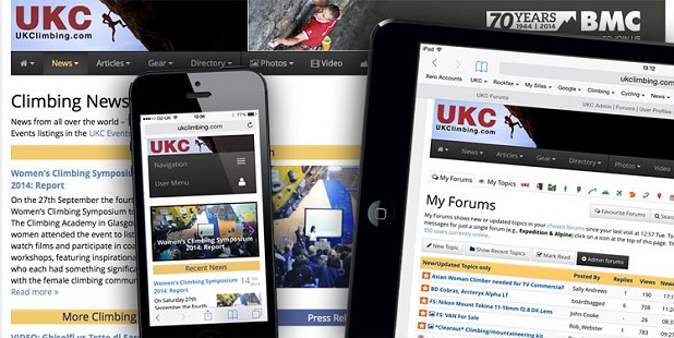
After months of effort we have just released a completely new design to the web site. The new look is a responsive layout which is aimed at working on cross platform devices like phones and tablets as well as taking account of the larger monitors many people now have.
The result is a web site that responds to the device it is being viewed on. From a maximum width of 1200 pixels wide, it dynamically resizes down to the narrowest phone width, shifting content around accordingly. For those on a laptop of PC, you can see this at work by grabbing the bottom right-hand corner of your web browser window and sliding it to the left slowly to watch the site re-size down in stages until you reach the narrowest widths which flexes to the size of the phone screen it is being viewed on.
Some browsing device figures:
- 36% of visitors to UKC are on mobiles or tablets (in 2010 this figure was 5.3%).
- Of these 59% are Apple iOS devices, which is 21% of all user visits to the site.
- And 40% are on Android devices, which is 14.4% of all user visits to the site.
- The remaining 1% is Windows tablets and phones.
Armed with these figures it was an obvious choice to make a site that better reflected the way people have been accessing UKC in the last few years.
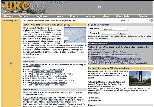
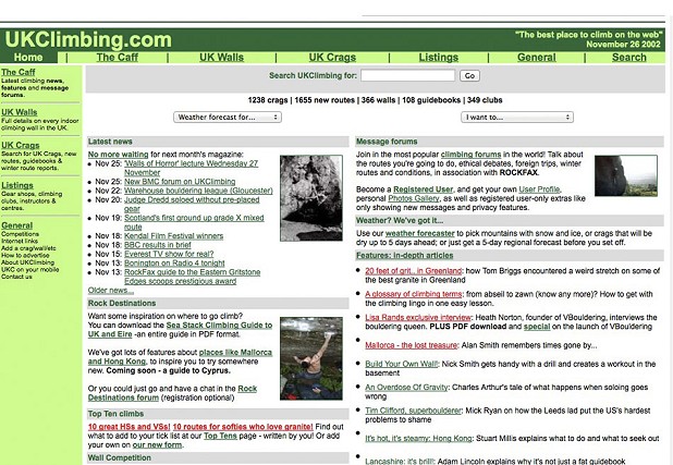
Amazingly, and it came as quite a shock to us, this is actually the first cross-site re-design since December 2002! There have been many changes and additions which altered the appearance of the site over the last 12 years, including a major facelift in March 2010, but never a full site change as big as this. Some examples of the home page from the past 13 years are below.
The improvements to the site have not finished though. The Logbooks section has only had a minor facelift, and it will have some significant changes when we release the Rockfax App. We also have many ideas for improving other sections of the site that this new responsive design allows us. The UKHIllwalking site will be getting the same overhaul over the next few weeks.
I would like to thank Paul Phillips for the huge amount of effort he has put in on this. The new site uses Bootstrap - the excellent open source framework for developing responsive projects on the web.




Comments