


In this series our mobile developers talk about some of technical details of the app, how they are implemented and why certain design decisions were made.
"Part 0" is programmer humour, which, like radio-4 humour, is not necessarily funny. Most mainstream programming languages address the first item in an array or list using 0, not 1. As far as I can tell all this does is add to the mental overhead for new programmers.
For this opening article in this series I've decided to talk about the topo view, presumably the most important part of a climbing guidebook app. A "view" means a screen, like a page in a website. Because we're discussing the early days, some of what I say will sound a bit iOS-centric. This is only because the Android app came later.
The topo was the first view that I wrote when I began the project, and it's one of the only views that I had a clear idea of before I started, which probably explains why it hasn't changed in the intervening seven years.
Because I'd fallen into the new-developer's trap of wanting to use a language I was familiar with to make it easier to learn how to write apps, the first iteration was written in Ruby (!) using an obscure Ruby compiler called RubyMotion. RubyMotion was based on something called MacRuby, which allowed development of Mac applications using Ruby instead of the standard language, Objective C. At the time, Apple was actively exploring alternative avenues for development on the Mac, so it was possible to write applications that used the Cocoa frameworks using languages like Ruby, Python and even Applescript (in fact, you definitely still can with Applescript, although it's a terrible idea!).

The big problem with topos is you want them to be big, and phones are small, or resource-constrained (at least they were in 2012 - much-less so now). The biggest jpeg I could get my iPhone 4s to open without it dying was only something like 9 megapixels, or 3000x3000 pixels, which would be ok for gritstone topos but rubbish for mountain crags.
I didn't want constraints on how big the images could be, so there were two possible solutions I could think of:
Cropping / downsampling
The first, and the "cleanest", was to use however big a jpeg I wanted, but when the phone displays it onscreen it would need to crop and/or downsample it to ensure it didn't run out of memory1. Instead of loading the whole image into RAM, you'd calculate what portion of the image was going to be visible, then read only the relevant pixels into memory and stick them onscreen. If you were viewing a zoomed-in crop of the image you'd just load that part, and if the image was zoomed out so you could see the whole thing you'd sample every tenth pixel or whatever and display only those (massively simplified description!). After reading around on this subject I realised it was significantly above the paygrade of a newbie developer, so I went with option #2:
Chopping (pre-tiling)
Chop up the images into tiles at various zoom levels - do this on the desktop as part of the package-making pipeline - then, on the phone, load only the tiles needed to display the portion of the image that's visible. This is way easier to implement in the app, but has the downside that now you need to chop up every single topo, map and overview image that's going to go into the app. This is boring to say the least, but it makes sense to shift as much work into the package pipeline as possible; do it once on my desktop computer rather than draining all our users' batteries.
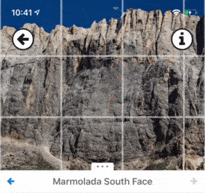
So I went with chopping up. You can see it in action below. Note how the grid changes - at the moment of the change, the system is loading new images for a different zoom level into memory. In non-debug mode, and on modern phones it's totally seamless - you'd think that you're looking at one giant image - but on older phones you'd catch a glimpse of a blurry tile when the zoom level transitioned. You can sometimes see this effect in PDF apps where they do a similar trick.
The process is now all automated, but it does lengthen the packaging stage a bit, particularly when the source images are large. For our Dolomites book, several of the topo source images are compositied .psd files that weigh in at over 500MB, so that one is very boring to export!
A debug mode showing the edges of the tiles being displayed
Now you have a million problems 😭
A major downside to chopping up is that you've now got a lot of files. The Marmolada South Face topo in the gif above is something like 250 tiles, once you've multiplied that by the number of images in a guide, and the number of guides in the catalogue, you're at quite a lot. This creates a couple of annoyances. The first is syncing the data between desktop computers. Having millions of tiny files is a great way to get dropbox to melt your computer. It's also a great way to make network transfers take forever because there's a setup overhead for each file that's transferred.
Unfortunately I didn't know this when I decided to chop the images up. Everything was in flux at that point - the app was maybe 10% finished and the format for the data was changing daily - so I would only ever create a small amount of data to test with. Only when the app was about to be released did I create packages for all of our books, and only then did it dawn on me how much waiting around for file transfers would be in my future.
Custom image format to the rescue
So for a few years we made do with the image format being a folder with loads of image tiles inside it, until one day I cracked and redesigned it. Now every image uses a custom .rockfax-image format, which under the hood is a SQLite database (pronounced "seequellite", like "kryptonite", apparently). This is nice because it's fast to read from (and write to, but we never need to write to it after the moment it's made), and it's a single file on disk, massively reducing the overhead for transfers. Having files transfer from my desktop onto my phone quickly during debugging felt like such a luxury.
Runtime drawing
The other big feature I wanted for the topo view was for the photo to be separate from the overlay (the route lines, topo notes etc) - I absolutely did not want the topo photo to have all this information flattened into it, which would be the simplest way of getting it onto the phone screen. I had this grand vision of being able to turn off different layers from the overlay so the user would have complete control over what was displayed. If a user wanted to turn off the route lines, but keep the belays and pitch grades, we should allow that!

Done by no one, ever
I'm stretching the truth a little with that last statement. Although it is possible to turn off the overlay bit-by-bit, that wasn't the goal driving the design, just a byproduct. The actual reasoning was that we already had the overlay in a vector format in Adobe InDesign (the desktop publishing software we use to lay out the books), so losing the high fidelity that offered just seemed like a bad thing to do. Keeping the vector data also meant that we could zoom to the bounds of a route line when that route is selected from the list, or zoom to the bounds of a sector if a topo shows more than one, stuff like that.
It also means of course that we can do very precise hit-testing on the topo (rather than simple bounds-testing, where you'd test if a touch is within the bounding rectangle of a line), so tapping a route line selects that route, even if the line is part of a tangled mess of eliminates - exactly what you'd expect it to do.
Below is an exploded view of the different layers that make up the topo view. All of these are tiling layers, but only the topo-image layer loads images. The rest are redrawing their paths as you zoom and pan around, only redrawing the lines that intersect with the current viewport.
 © rockfax
Starting at the top, we've got:
- Focussed-routeline layer: it's possible to turn off everything except the selected route (long-press on the topo for the menu). When you do this, the focussed-routeline layer is what's left. The interesting thing about this layer is that it requires a load of calculations to find all the belays or loweroffs that intersect the routeline its showing, because these don't "belong" to any particular routeline in the database model. This layer is masked to slightly larger than the bounding rectangle of the line, which means there's less transparent area that has to go through the compositing stages.
- Overlay layer: this is where all the routelines, route numbers, topo notes etc get drawn.
- Selected routeline highlight layer: when you select a route, that route's line has an outline path drawn around it, on a layer beneath the layer for the routeline. This layer gets a mask for performance too.
- Topo-image layer: deals with loading the image tiles from disk
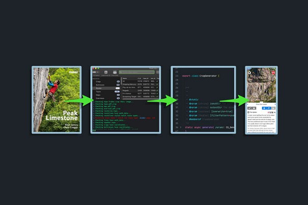
And just for kicks, here's a snippet of what the vector data looks like in our intermediate format. This is what it looks like after it's been exported from InDesign, ingested and processed by a custom desktop application we call Klang, and finally exported ready for packaging up. Then, when you install a package in the app, this json-format data is downloaded, processed and stored in a database on the device.

That's it for this post. In the next one I'll talk about the data-processing pipeline that gets the data from InDesign into the app, which is surprisingly complex!
You can find the Rockfax Digital on the App Store for iOS and the Play Store for Android, and sign up for a subscription at rockfax.digital.
1. Even though images like jpegs can be tiny on disk, once they're decoded and loaded into memory, they take up 4 bytes per pixel for [red, green, blue, alpha/opacity], so a 3000x3000px image is 3000 * 3000 * 4 bytes = 36MB.↩
UKC Articles and Gear Reviews by Stephen Horne Rockfax
- ARTICLE: Rockfax Digital Deep Dives Part 1 - The Data Pipeline 12 May, 2021
- COMPARISON REVIEW: Soft Shells 19 Jul, 2012
- Scarpa Vapour Lace Up Rock Shoes 19 Aug, 2010


Comments
Great insight, thanks for that and one can see how it must have been an absolute PITA to rewrite the app for android when it was all based around iOS in the beginning, but hey it had to start somewhere!
that was cool.
do you need an alpha channel for displaying topos ? could save some space !
Martin (our Android developer) loves a multi-year challenge luckily =]
It's a good point. No, we don't, and it's possible (in iOS terms) that the os doesn't need this information if you set `layer.isOpaque = true` on the backing layer of the tiling view, but I'm not sure. I guess that would make sense, but I've only ever thought of doing that to prevent the layer having to go through a compositing phase for the layers beneath if there's not needed.
I've just spoken to Martin about this. In the Android version he passes in a flag to the image decoder to specify no alpha, which was apparently a necessary optimisation to get things performant. JPEGs inherently have no alpha channel, so that seems a bit weird to me. Things are a bit different in iOSLand, where it's the backing layer of the view that's dealing with the alpha.
I load the image from disk, then draw it into a drawing context for one of the layers, which does have an alpha channel. I've just set this layer to opaque to see if I can see a corresponding reduction in the memory footprint, but the profiler has stopped working for the moment = If I can get it working I'll report back.