


User Comments
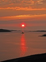
Trying to use Photoshop to get better image quality. Comments/suggestions about image quality welcome.
Fiend - 20/May/08
Looks like you've found the landscape-over-saturation button, then. That red looks OTT to me, sorry.
Jon Read - 20/May/08
Youve seriously f@cked that up
The Pylon King - 20/May/08
Actually I did very little tweaking to this apart from brightening it and using a bit of hue/contrast to avoid it being washed out from the brightening - it was very red on the camera image (which was taken on a too-dark setting).
The original (3.3 meg) is here: http://www.fiendy.pwp.blueyonder.co.uk/IMG_1655_upload.jpg
Fiend - 21/May/08
The original (3.3 meg) is here: http://www.fiendy.pwp.blueyonder.co.uk/IMG_1655_upload.jpg
You meant to post this here: www.shipphotos.co.uk/gallery, right?
stuckonarock - 21/May/08
Photo replaced with a slightly more muted version.
Fiend - 23/May/08
Still looks bollox
The Pylon King - 08/Jun/08
Thanks for that entirely useless comment. I don't suppose you actually looked at the link to the original photo?? It still looks pretty much exactly in-between what the camera took and what it actually looked like. I *could* change it into an entirely different image....if I wanted a futile exercise in not trying to capture the scene. Which I don't.
Fiend - 08/Jun/08
Yeah,yeah blah blah blah... but it still looks unnatural - the camera, unfortunately, does often lie, and that is certainly not what the actual scene looked like!
The Pylon King - 08/Jun/08
Original looks much better
The Pylon King - 08/Jun/08
The original looks redder and more saturated than this (and unrealistically dark). The true scene looked slightly less red. This image is a balance in-between.
Fiend - 09/Jun/08
This will teach me to waste my time asking for comments!! Bunch of arse!!
Fiend - 09/Sep/08