This topic has been archived, and won't accept reply postings.
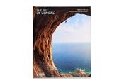
![[Pembroke, 3 kb] [Pembroke, 3 kb]](http://img.ukclimbing.com/t/123475.jpg) The Pembroke Rockfax first appeared in 1995 amidst a storm of controversy but for those who used the book it was a breadth of fresh air, enabling them to view an assess the magnificent sea cliff routes better than ever before. In the intervening 14 years a lot has happened in the guidebook world. So could the new edition of this book improve on its predecessor? Neil Foster, experienced Pembroke climber and guidebook aficionado takes a look.
The Pembroke Rockfax first appeared in 1995 amidst a storm of controversy but for those who used the book it was a breadth of fresh air, enabling them to view an assess the magnificent sea cliff routes better than ever before. In the intervening 14 years a lot has happened in the guidebook world. So could the new edition of this book improve on its predecessor? Neil Foster, experienced Pembroke climber and guidebook aficionado takes a look.Read more at http://www.ukclimbing.com/gear/review.php?id=2148
Any news on the Climbers Club book release date? I hear it could be a better guide?
In reply to UKC Gear: It's a lovely book but I'd have liked to see more St. David's stuff personally - Craig Coetan is surely worth inclusion?
In reply to Jus: the cover is so bad - a small point perhaps but surely Pembroke deserves something truly inspirational? the contents do look great though.
the photo of Gaz Parry? on the crux of The Minotaur is a step too far for beta (which im all for in guidebooks), annoying.
the photo of Gaz Parry? on the crux of The Minotaur is a step too far for beta (which im all for in guidebooks), annoying.
In reply to UKC Gear:
Nicely laid out but still very selective ignoring some great routes, eg Pan in No Man's Zawn, the routes in Raming Hole including Wet Threat etc
Nicely laid out but still very selective ignoring some great routes, eg Pan in No Man's Zawn, the routes in Raming Hole including Wet Threat etc
In reply to kevin stephens:
Any others?
To be honest Raming Hole is way beyond the scope of a guidebook like this. No Man's Zawn was the next on the list to get in, but really it would have been a lot of pages for essentially one extremely tidal E4.
Alan
> Nicely laid out but still very selective ignoring some great routes, eg Pan in No Man's Zawn, the routes in Raming Hole including Wet Threat etc
Any others?
To be honest Raming Hole is way beyond the scope of a guidebook like this. No Man's Zawn was the next on the list to get in, but really it would have been a lot of pages for essentially one extremely tidal E4.
Alan
In reply to Alan James - UKC:
Used it for the 1 st time weekend before last, thought it was great pictures speak a thousand words, does everything that the average pembroke weekend climber could ask for and it now covers some of the crags i moderate.... a few more logged ascents perhaps??
as for the cover pic it ticks alot of boxes.. female climber wearing a helmet(wow) on a classic route that many first time visitors to pembroke aspire to...
In reply to Paul Bowen:
Also doesnt tick a lot of boxes.... Inspiring, jaw dropping, palm sweating to name a few.
> as for the cover pic it ticks alot of boxes.. female climber wearing a helmet(wow) on a classic route that many first time visitors to pembroke aspire to...
Also doesnt tick a lot of boxes.... Inspiring, jaw dropping, palm sweating to name a few.
In reply to Paul Bowen:
Thanks Paul.
We do put an unbelievable amount of work into these guides and it is nice to have someone comment positively.
Alan
Thanks Paul.
We do put an unbelievable amount of work into these guides and it is nice to have someone comment positively.
Alan
In reply to kevin stephens:
I agree, but i would still rather see a mega inspiring photo of some wad crushing an E7, than somone on an HS.
I agree, but i would still rather see a mega inspiring photo of some wad crushing an E7, than somone on an HS.
In reply to Will Goldsmith:
My main complaint about the guide is the shade of red used to mark the lines on the topos. No good to us 10% of blokes (and 1% of womenfolk) who are colour-challenged.
My main complaint about the guide is the shade of red used to mark the lines on the topos. No good to us 10% of blokes (and 1% of womenfolk) who are colour-challenged.
In reply to Will Goldsmith:
One thing that 18 years of guidebook production has taught me is that cover photos of 'wads crushing E7s' are not appreciated by the vast majority of readers.
However, I acknowledge that this cover photo hasn't gone down that well. Hopefully we have it right on the new France guide - http://www.rockfax.com/images/i.php?id=855
Alan
> I agree, but i would still rather see a mega inspiring photo of some wad crushing an E7, than somone on an HS.
One thing that 18 years of guidebook production has taught me is that cover photos of 'wads crushing E7s' are not appreciated by the vast majority of readers.
However, I acknowledge that this cover photo hasn't gone down that well. Hopefully we have it right on the new France guide - http://www.rockfax.com/images/i.php?id=855
Alan
In reply to Alan James - UKC:
Hmm.. Chorro, Pembroke and now Southern France all now with uninspiring covers IMO. Sorry. The Pembroke one looks like an 80s photo minus some lycra leggings.
Hmm.. Chorro, Pembroke and now Southern France all now with uninspiring covers IMO. Sorry. The Pembroke one looks like an 80s photo minus some lycra leggings.
In reply to Owen W-G:
Unfortunately though, red is BY FAR the most clear colour to use on variable rock colours. We have tried all the alternatives and yellow and orange are nearest to working but don't compare really.
By all means suggest an alternative, but I am pretty sure you'll find that any alternative will be worse for 90% of men, and 99% of women.
Alan
> My main complaint about the guide is the shade of red used to mark the lines on the topos. No good to us 10% of blokes (and 1% of womenfolk) who are colour-challenged.
Unfortunately though, red is BY FAR the most clear colour to use on variable rock colours. We have tried all the alternatives and yellow and orange are nearest to working but don't compare really.
By all means suggest an alternative, but I am pretty sure you'll find that any alternative will be worse for 90% of men, and 99% of women.
Alan
In reply to Alan James - UKC:
Is it cente patates at ceuse (just L of biography wall)? Don't get me wrong - it's an alright photo and I love ceuse (I've spent about 2 months of my summers there so far) but it doesn't get me psyched out of my mind to get back there unlike eg.
http://www.ukclimbing.com/images/dbpage.php?id=95813
Maybe there's certain things you need from the cover shot which exclude dark shots like that etc, but Adrian's a good photographer and I'd bet he's got some better pics than that...
In reply to Alan James - UKC:
Or maybe a chot of someone on the azincourt wall at Buoux - it doesn't get more inspiring than that!
Or maybe a chot of someone on the azincourt wall at Buoux - it doesn't get more inspiring than that!
In reply to UKC Gear:
I can't believe the debate here is about the cover image. Surely the book is purchased to help the buyer choose and find routes, which it does really well (I have actually spent a whole morning on St. David's Head looking for a crag that I never found using the old CC guide). The topos are brilliant and the other info for each climb/crag is really useful too. As I now own the book, and have had a good look through it - some absolutely stunning images throughout - then the only purpose the cover image serves for me is to identify the right book when I'm packing to go south. And it does this just fine.
I can't believe the debate here is about the cover image. Surely the book is purchased to help the buyer choose and find routes, which it does really well (I have actually spent a whole morning on St. David's Head looking for a crag that I never found using the old CC guide). The topos are brilliant and the other info for each climb/crag is really useful too. As I now own the book, and have had a good look through it - some absolutely stunning images throughout - then the only purpose the cover image serves for me is to identify the right book when I'm packing to go south. And it does this just fine.
In reply to Alan James - UKC:
I'm surprised at that - as a punter I still find good shots of wild moves inspiring. I think what people get a bit jaded with are the magazine cover 'sponsored climber on E7' shots.
Either way, its probably not going to affect Pembroke sales much - I doubt many people buy that guide on impulse.
An observation (NOT a critiscism)- it seems remarkable how, even with vastly more routes in it than the previous book, it still feels far more 'selective' than, say Eastern Grit.
> One thing that 18 years of guidebook production has taught me is that cover photos of 'wads crushing E7s' are not appreciated by the vast majority of readers.
I'm surprised at that - as a punter I still find good shots of wild moves inspiring. I think what people get a bit jaded with are the magazine cover 'sponsored climber on E7' shots.
Either way, its probably not going to affect Pembroke sales much - I doubt many people buy that guide on impulse.
An observation (NOT a critiscism)- it seems remarkable how, even with vastly more routes in it than the previous book, it still feels far more 'selective' than, say Eastern Grit.
In reply to Alan James - UKC: have to disagree with Abarro - think the rock looks gorgeous, the climb looks cool and i really like the light / shade and colours. i havent climbed at Ceuse or Buoux (to be rectified soon i hope) but the photo makes me want to get there sooner and open / buy the guide.
In reply to Alan James - UKC:
i like the France cover a lot.
The Pembroke cover looks like an over-photoshopped old image from the days of La Sportiva Mythos and lilac helmets.
Perhaps it's inspiring to some people but not to me, sorry. I prefer the old Huntsmans leap one! I also don't like the pale yellow colour of the font.
I'm interested, how did you come to deciding on it?
Inside though the guide is amazing, and has some awesome photos too.
In reply to Jus:
There are worse guidebook covers out there - eg Chris Craggs arse on the front of the old Wye Valley guide.
Besides, the old adage of not judging books by there cover is widely ignored here - it seems to be the main talking point.
Without being sexist, I prefer to see pics of Chicks than geesers. But it doesn't show much other than the chick herself, and doesn't for me summ up the Pembroke experience.
My judgement of the new book is coloured also by fact that I thought the £5 miniguide was excellent and has served me well over the years, such that the new guide won't change my experience of climbing there much. If I had the old 1996 guide I might feel differently.
In reply to Jus:
We tend to produce a few alternatives and I circulate the alternatives around the various Rockfax authors who have their say. In this case the alternatives are on page 109, 141 and a Pleasure Dome shot that was eventually usurped by Jamie Moss's brilliant shot on page 134 (which is horizontal and came too late for cover consideration anyway). The decision this time was split so Mike and myself decided.
Alan
> I'm interested, how did you come to deciding on it?
We tend to produce a few alternatives and I circulate the alternatives around the various Rockfax authors who have their say. In this case the alternatives are on page 109, 141 and a Pleasure Dome shot that was eventually usurped by Jamie Moss's brilliant shot on page 134 (which is horizontal and came too late for cover consideration anyway). The decision this time was split so Mike and myself decided.
Alan
In reply to Alan James - UKC:
I quite like the Pembroke cover - shows that it's not just a place for scary epics. Definately an improvement on that bloke in bright orange trousers!
Just thinking - why not have a gallery of all the pics used on the rockfax web site (or on UKC) and allow voting to see which images people like and dislike. You might even find people wanting to buy copies of the pics. Another idea, why not prduce a calendar of some of the best pics
In reply to Alan James - UKC:
I had a marvellous trip to Pembroke about a month ago and using the new guide made it even more of a pleasure. It really is stunning and I for one cannot believe the negativity that you are being faced with here. It must be really frustrating to poor so much love into a publication for the masses to then start picking to pieces the one percent that they don't agree with. We stayed in the CC hut and people there were taking great pleasure in spotting typos or places were a topo was slightly misdirected. I got quite angry about it at the time because it is probably THE best guide I have had the pleasure to buy. It is, and will be for some time my bed time reading and it will inspire dreams and desires for years to come!
Thanks Alan and Mikey, it is a joy!
In reply to spacey:
If its any consolation, the CC do that to their own guidebook drafts as well. I guess a thick skin has to go with the territory.
If its any consolation, the CC do that to their own guidebook drafts as well. I guess a thick skin has to go with the territory.
In reply to Alan James - UKC: Why did my post get deleted? All I said was that the cover photo was bad. That sort of censoring is a little pathetic, no? I never see you censoring a positive comment because you don't agree with it. How many of the negative comments did you delete from the BMC guidebook thread that was on here recently?
I've looked at the Pembroke guide, and although I haven't used it yet I thought it looked excellent - the usual colourful, clear, modern guide we're used to, so well done.
I've looked at the Pembroke guide, and although I haven't used it yet I thought it looked excellent - the usual colourful, clear, modern guide we're used to, so well done.
In reply to Sam L:
Apologies. That was a knee-jerk over-reaction from me last night. I was a bit fed up with the endless comments about the cover without anyone mentioning anything else, and your assessment was particularly savage. Shouldn't have been removed though.
Regarding censorship - we will always respond to people who feel things have been removed, or need to be removed. We do remove a fair amount of 'this is crap' type comments where they offer no real argument, especially on gear reviews. If this thread hadn't be a Rockfax guide, I would probably have removed more of the unqualified criticism.
Appreciated.
Alan
> (In reply to Alan James - UKC) Why did my post get deleted? All I said was that the cover photo was bad.
Apologies. That was a knee-jerk over-reaction from me last night. I was a bit fed up with the endless comments about the cover without anyone mentioning anything else, and your assessment was particularly savage. Shouldn't have been removed though.
Regarding censorship - we will always respond to people who feel things have been removed, or need to be removed. We do remove a fair amount of 'this is crap' type comments where they offer no real argument, especially on gear reviews. If this thread hadn't be a Rockfax guide, I would probably have removed more of the unqualified criticism.
> I've looked at the Pembroke guide, and although I haven't used it yet I thought it looked excellent - the usual colourful, clear, modern guide we're used to, so well done.
Appreciated.
Alan
In reply to Alan James - UKC:
An excellent guide so well done guys. Cannot wait to use it on my ever expanding Pembroke hit-list!
Cheers
Dave
An excellent guide so well done guys. Cannot wait to use it on my ever expanding Pembroke hit-list!
Cheers
Dave
In reply to Alan James - UKC:
Part of my job is choosing cover shots for other kinds of publications (no, not those ones!), and I go through a similar process.
For future publications, I do like the idea of creating mock covers of possible candidates and uploading them on here for people to vote on! Don't you think it's a good idea?
In reply to Jus:
We did it once before, and it wasn't hugely successful. However we didn't have the UKC photo voting system then which is a great way of getting a lot of opinions on an equal basis. So, yes, it is perhaps something we should think about in the future.
As a cover photo-chooser, you'll be aware I'm sure of the extra requirements of a cover photo which usually mean that the best, or most striking photos, are not necessarily the ones that you can choose.
Alan
> For future publications, I do like the idea of creating mock covers of possible candidates and uploading them on here for people to vote on! Don't you think it's a good idea?
We did it once before, and it wasn't hugely successful. However we didn't have the UKC photo voting system then which is a great way of getting a lot of opinions on an equal basis. So, yes, it is perhaps something we should think about in the future.
As a cover photo-chooser, you'll be aware I'm sure of the extra requirements of a cover photo which usually mean that the best, or most striking photos, are not necessarily the ones that you can choose.
Alan
In reply to Alan James - UKC:
yep, sure do!
> (In reply to Jus)
> [...]
>
>
> As a cover photo-chooser, you'll be aware I'm sure of the extra requirements of a cover photo which usually mean that the best, or most striking photos, are not necessarily the ones that you can choose.
>
> Alan
> [...]
>
>
> As a cover photo-chooser, you'll be aware I'm sure of the extra requirements of a cover photo which usually mean that the best, or most striking photos, are not necessarily the ones that you can choose.
>
> Alan
yep, sure do!
In reply to Alan James - UKC:
Hi Alan, I can't see any (well almost...) of the red dotted lines against grey or murky brown - by far the most popular colour limestone has chosen for itself. Yellow, on the other hand jumps out at me from the page. Pleeeeeeease use yellow. Jon.
> (In reply to Owen W-G)
> [...]
>
> Unfortunately though, red is BY FAR the most clear colour to use on variable rock colours. We have tried all the alternatives and yellow and orange are nearest to working but don't compare really.
>
> By all means suggest an alternative, but I am pretty sure you'll find that any alternative will be worse for 90% of men, and 99% of women.
>
> Alan
Hi Alan, I can't see any (well almost...) of the red dotted lines against grey or murky brown - by far the most popular colour limestone has chosen for itself. Yellow, on the other hand jumps out at me from the page. Pleeeeeeease use yellow. Jon.
This topic has been archived, and won't accept reply postings.
Elsewhere on the site
Loading Notifications...


