


The Climbing Calendar, Scotland 2006 - Cubby Images
As a professional photographer and writer, I am always rather reluctant to say much about the work of my peers, being only too aware myself of the problems and pitfalls inherent in climbing photography.
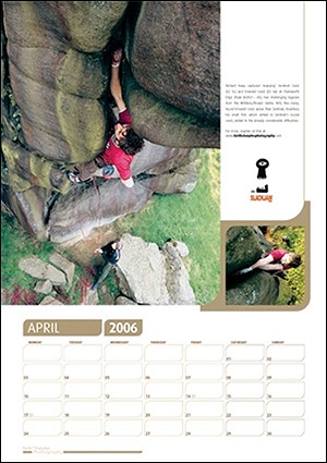
These are both fine calendars that are functional while not being breathtakingly outstanding. They are both much more suited to the office than the home, simply because they have such an overtly commercial feel. I want to make this point at the very outset, before I consider the merits of the calendars in greater detail: both of them are sponsored by different equipment manufacturers for each month, and this means that a company logo looms large on every page. It is usually far too obtrusive, and often distracts the eye from the main image. This is of course exactly what the manufacturers want, but I for one don't particularly like having advertisements hanging on my living room wall. (In defence of Keith Sharples I should point out that he has pledged a percentage of the proceeds of his calendar to ACT - the Access and Conservation Trust.)
The two calendars have rather differing content. Cubby Cuthbertson's The Climbing Calendar: Scotland 2006, is exactly what it says on the lid: a fine collection of pictures showing the full wealth and variety of climbing that is on offer in Scotland, and so has a greater feeling of unity. Keith Sharples' climbing:06, on the other hand, features a very mixed bag of climbing images that for my taste is both too broad and too narrow at the same time. Too broad because it is a haphazard assortment of images from both at home and abroad, with no obvious unifying theme, and too narrow because of what it misses out: there are four shots from Europe, five from the Peak and Yorkshire, two on English sea cliffs, just one from the Lake District and one from the United States, and nothing in either Scotland or Wales. And no winter climbing at all.
On the back of the calendar, Sharples says that it is in fact aimed at 'rock climbers of any and every persuasion, ability and domicile'. But this is not really true. There is not a single image of a mountain rock climb (Castle Rock at Triermain is really a valley crag) and, as I say, there is nothing in either Wales or Scotland. Furthermore, I think a lot of the pictures are of climbs that are rather too hard for the average climber to relate or aspire to. My overriding criterion in judging a climbing picture is always does this image really make me want to go out and climb it?
Only two of the pictures really fulfill this criterion for me: that of Déjà Vu in the Great Zawn at Bosigran - a fine shot - and Overhanging Bastion in the Lakes. Yet, amazingly, the latter manages to make the route (now I see rather surprisingly upgraded to HVS) almost unrecognisably easier and gentler than I remember it i.e. here it looks about Severe at most. Conversely, I find some of the pictures quite a turn-off. Now I know all this is a matter of taste, but many photos of relentlessly overhanging sport routes - such as that of Steve McClure on the dauntingly fierce Ne Dieu Ni Maitre (F8b+) - have a rather joyless, 'arduous training' ambience about them, without little sense of flow or beauty of movement. Keith calls Urgent Action at Kilnsey a 'pump-fest', but it looks frankly grim to me, indeed faintly ludicrous in that it appears to be so contrived. One of the problems with it is that, although I believe this overhang is quite a long way up the crag, it's very hard to tell from the picture. There is a small pile of gear on the right of frame that looks almost like a few slings and some rock boots, so that this could perhaps be little more than a high-ball boulder problem. I just don't know. But it certainly looks contrived, with a massive pre-placed quick-draw on a huge bolt, hanging literally six inches from the climber's left hand. I may be in a minority - maybe it's age creeping in! - but I must confess I'm getting rather tired of this type of aesthetically unattractive image of an ultra-strenuous move that we now see so often. It's certainly tiring to look at.
Also, sadly, many of the pictures, like this one, are just too far away from the action to be particularly involving (this of course is not an issue if the picture is really about something other than simply the climbing). There are, however, two striking exceptions: Richard Heap on Sentinel Crack at Chatsworth and Neil Foster on Party in the Park on High Tor - wide-angle shots taken from a static line quite close to the climber that give a good insight into the true nature and feel of the climbing.
Bouldering pictures have of course to be outstandingly interesting to warrant a place in a calendar. Keith Sharples has two: one quite attractive picture of a fairly ordinary-looking little problem on an egg-like boulder in Sardinia, and a thoroughly unremarkable snapshot of someone bouldering at Stanage Plantation that is neither involving nor interesting. All it really serves to show is the depressingly severe ground erosion that has taken place around the boulder and the unsightly defacement of the rock by chalk that the recent over-obsessive practice of this branch of the sport has led to.
All these pictures would work better, though, if it were not for the fussy, self-conscious design: each main photograph is accompanied by a much smaller inset image in a heavy, gimmicky gold frame of curves and spikes. These small images do nothing to help, indeed they detract: they are really too small on the scale of the rest of the calendar, particularly once it's hung on an office wall, to be particularly intelligible. Frustratingly, in one or two cases the smaller image looks rather more interesting than the main image (e.g. the DWS picture at Swanage.)
This calendar is obviously the product of much enthusiasm, which bubbles out in sometimes funny captions, full of trendy words like 'out-there', 'cruising' and 'funkiest', and peppered with exclamation marks. But, sadly, this ultimately hinders rather than helps, with the captions apparently trying to tell us just how good the climbing is, without letting the images speak for themselves. And the word 'stunning' is used no less than seven times - in one caption, twice. I really feel it is high time this tired old catchword was consigned to the rubbish bin.
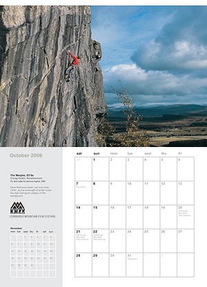
Cubby Image's Climbing Calendar, Scotland 2006 is altogether more traditional and serious in approach, suggesting some broader underlying values, a deeper love of nature, and consequently provides a broader, more balanced view of the sport. While many of Cubby's images, like Keith Sharples', are not particularly involving, they win all round on sheer aesthetics. When it comes to judging a climbing photograph as a photograph, my criterion is even crueller than the overriding one I mentioned above. I find myself asking the question: how would this picture be appraised by a non-climber? Which is another way of saying: has the picture any real artistic or aesthetic merit?
No less than five of Cubby's pictures are of winter climbing, and although I lost all interest in this branch of the sport many years ago after a near-fatal accident, he manages to convey its appeal extremely well. Outstanding are his pictures of The Wand on Creag Meagaidh, in which Blair Fyffe is weaving his way through a vertical fantasy grotto of 'ice umbrellas' (a pity though that his caption came adrift grammatically with an 'updraft' resembling the gaping jaws of a shark'!), and Un Poco Loco Direct, in which Es Tresidder is making an imaginative new route through the great ice-rimed rock sculpture of Church Door Buttress on Bidean. As in so many of Cubby's pictures, the wonders of nature are at least as important as the climbs themselves.
Whether it is in the mountains (eight pictures), low-lying crags (two), sea cliffs (one), or bouldering (just one, but it's very good), Cubby shows that he is interested above all in the beauty of the environment, in rock and ice textures, and interesting light or atmospheric conditions. Interestingly, none of the pictures is of a sport climb, though I suspect that this is less the result of a deliberate decision than an interest in only taking pictures of climbs in beautiful settings.
Both these calendars should be available at your local climbing shop and at online climbing shops. They are of course available at Keith Sharples Photography and Cubby Images
Gordon Stainforth is an award winning landscape photographer. He is the author of several illustrated books on the British mountains and hills; Eyes to the Hills, Lakeland, The Cuillin, and The Peak: Past and Present. Recently he researched, compiled and designed the exhibition, "The Crux" displayed at the Kendal Mountain Festivals that celebrated the whole history of British mountaineering and rock climbing achievement in just 25 classic photographs from 1880 onwards.
Visit his website at: gordonstainforth.co.uk
Check Alan James's review of the Lakes 360 Calendar


Comments