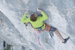
The day was very, very dark and I didn't have a rope to get close to Pete. I was using a borrowed lens, at 200mm zoom. That's quite 'zoomy' and loses a lot of light - hence the slight grainy effect.
The 200mm zoom also brings the depth of field (which bits are in focus) quite narrow - meaning the ground on the left (which is quite a lot further away than Pete and the arete) goes a bit blurred.
What I have done:
Firstly I cut the image in to 3 layers: left background, Pete, Slate buttress.
I darkened slightly the left background (levels) and added a slight (perhaps too much) blur. This area of the photo was already slightly blurred.
I tweaked the 'levels' on Pete to make him less 'flat' - creating a bit of 'pop' - this could be what Toby doesn't like.
I then 'burnt' the right side of the buttress layer slightly to darken the edges.
Any blur on the arete/buttress itself is due to the fact that the whole image was shot in very low light.
In reply to Jack Geldard - Assistant Editor: I (personally) think the original version is fine, could do with a slight upping of contrast and saturation. Definitely do away with the added background blur anyway. What ISO were you shooting at?
Jack, having a quick play with that original it looks to me that the background is closer to being in focus than the arete. If that's the case its always going to be a battle to make it appear the opposite!
Adding lens blur [i]convincingly[/i] is very difficult, especially when the background isn't all equally distant - you need to apply a graduated mask so the blur is applied more heavily at the top than the bottom.
Much prefer to use a bigger film/ sensor format in the first place!
Simon Panton not logged in26 Feb 2008
In reply to Chris Craggs: I like the lighter one best; I find too much jiggery pokery a bit of a turn off, unless it is done in subtle fashion (i.e. you can't really tell).
Jack's pic shows the route well, but Gareth Aston got some pics side on which show the moves in a more intimate way:
Either way its a very photogenic route and a definite candidate for a front cover of the new Slate guide - perhaps with an early morning sun shot (if Pete will go back on it?)
In reply to Chris Craggs: of all of them I reckon the Darker Background works the best. just a pity about that one diamond shaped spot on the rock behind being overexposed.