
This topic has been archived, and won't accept reply postings.
One of mine -
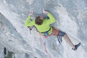
http://www.ukclimbing.com/images/dbpage.php?id=265616
Not sure what it is, I suspect the post processing is not to everyone's taste, and the removal of paraphernalia at the base of the crag was a bit rough. Still, someone thought it was only worth a 2.
Anyone have any other examples? Doesn't have to be one of your own.
In reply to planetmarshall:
Well... can't be arsed to look through them pics. But composition is also not that good on your pic. Or rather timing. It's the classic shoulders -pic, with the added negative bonus of the climbing looking down. So all you see is pretty much two hands, shoulders and quite Instagrammy post processing.
Had you seen more the the climbers face and perhaps even more of his body positioning, the pic would have been rather good...
1
In reply to HeMa:
Well the climber will look where he looks - not much I can do about that. The post processing is actually rather involved, so it's unfortunate that you think it looks Instagrammy (In pre digital times the technique was known as a bleach bypass, and predates Instagram by at least 60 years).
> Well... can't be arsed to look through them pics. But composition is also not that good on your pic. Or rather timing. It's the classic shoulders -pic, with the added negative bonus of the climbing looking down. So all you see is pretty much two hands, shoulders and quite Instagrammy post processing.
Well the climber will look where he looks - not much I can do about that. The post processing is actually rather involved, so it's unfortunate that you think it looks Instagrammy (In pre digital times the technique was known as a bleach bypass, and predates Instagram by at least 60 years).
4
In reply to planetmarshall:
Great thread. Here are a few I think have missed out on votes for various reasons, some more obvious than others:
http://www.ukclimbing.com/images/dbpage.php?id=260851
http://www.ukclimbing.com/images/dbpage.php?id=256692
http://www.ukclimbing.com/images/dbpage.php?id=250078
Great thread. Here are a few I think have missed out on votes for various reasons, some more obvious than others:
http://www.ukclimbing.com/images/dbpage.php?id=260851
http://www.ukclimbing.com/images/dbpage.php?id=256692
http://www.ukclimbing.com/images/dbpage.php?id=250078
In reply to HeMa:
Plus the editing out of stuff at the base of the crag is awful.
Plus the editing out of stuff at the base of the crag is awful.
Post edited at 12:21
3
In reply to ianstevens:
Since it's just web resolution I didn't spend much time on it. I'll take another look at it later.
> Plus the editing out of stuff at the base of the crag is awful.
Since it's just web resolution I didn't spend much time on it. I'll take another look at it later.
In reply to planetmarshall:
It's just that there's an obvious black mark were you've removed something. Otherwise I actually quite like the photo!
> Since it's just web resolution I didn't spend much time on it. I'll take another look at it later.
It's just that there's an obvious black mark were you've removed something. Otherwise I actually quite like the photo!
In reply to ianstevens:
Actually that's a jacket or rope bag, so it's a black mark where I forgot to remove something
> It's just that there's an obvious black mark were you've removed something.
Actually that's a jacket or rope bag, so it's a black mark where I forgot to remove something
1
2
In reply to planetmarshall:
I think you have answered your own question with your last two posts as to why others are not marking higher !!
I think you have answered your own question with your last two posts as to why others are not marking higher !!
1
In reply to HeMa:
Cheers for the constructive criticism. The camera was on continuous shooting, I'll have a look and see if any of the other frames are better - but I quite liked the stretching hands in this one.
> Had you seen more the the climbers face and perhaps even more of his body positioning, the pic would have been rather good...
Cheers for the constructive criticism. The camera was on continuous shooting, I'll have a look and see if any of the other frames are better - but I quite liked the stretching hands in this one.
In reply to Mark Collins:
Like the bothy shot, but the others don't really do anything for me. Had the climber in the first photo been leading I think it would have been a better situation and thus photograph (though obviously harder to capture).
Like the bothy shot, but the others don't really do anything for me. Had the climber in the first photo been leading I think it would have been a better situation and thus photograph (though obviously harder to capture).
In reply to planetmarshall:
Out of curiosity was the climber in your OP actually leading? He is a long way below the runner.
It's not a bad shot, but I found the colouring very bland, and I agree with the comments that the climber is looking down which (to me) tends to rob it of interest. The photo of the young girl is a lot more interesting as a climbing shot, particularly the look of enjoyment on her face.
> Like the bothy shot, but the others don't really do anything for me. Had the climber in the first photo been leading I think it would have been a better situation and thus photograph (though obviously harder to capture).
Out of curiosity was the climber in your OP actually leading? He is a long way below the runner.
It's not a bad shot, but I found the colouring very bland, and I agree with the comments that the climber is looking down which (to me) tends to rob it of interest. The photo of the young girl is a lot more interesting as a climbing shot, particularly the look of enjoyment on her face.
In reply to Trangia:
Yes.
Fair comment.
> Out of curiosity was the climber in your OP actually leading? He is a long way below the runner.
Yes.
> It's not a bad shot, but I found the colouring very bland...
Fair comment.
In reply to Trangia:
I can't quite put my finger on it. Maybe it just looks a bit posed to me, or maybe I just don't like seeing climbers enjoy themselves...
> The photo of the young girl is a lot more interesting as a climbing shot, particularly the look of enjoyment on her face.
I can't quite put my finger on it. Maybe it just looks a bit posed to me, or maybe I just don't like seeing climbers enjoy themselves...
1
In reply to Trangia:
This isn't something that really bothers me in a climbing photo - I'd rather have the climber involved in the situation than obviously aware of the camera ( though the best of both worlds is ideal ) - eg Mr Tibbett's latest : http://www.ukclimbing.com/images/dbpage.php?id=265304
> ...and I agree with the comments that the climber is looking down which (to me) tends to rob it of interest.
This isn't something that really bothers me in a climbing photo - I'd rather have the climber involved in the situation than obviously aware of the camera ( though the best of both worlds is ideal ) - eg Mr Tibbett's latest : http://www.ukclimbing.com/images/dbpage.php?id=265304
Post edited at 13:13
In reply to planetmarshall:
It's a shame the climber isn't looking up, just unlucky with this one I guess, did you shoot a lot of frames? The post work isn't to my taste as it distracts from reality but I appreciate it can draw out certain emotions retrospectively, i.e. B&W
You've got some great photos in your gallery
I like this one - http://www.ukclimbing.com/images/dbpage.php?id=245907 the over exposed hand looks great
My own example would be - http://www.ukclimbing.com/images/dbpage.php?id=264006
I like the way the shot is split between the cruel sea and sublime rock but I'd understand if that's just my experience of having been there skewing my opinion.
In reply to planetmarshall:
Not a wrong rating as such, but here's one that I wished I'd made a different comment on.
http://www.ukclimbing.com/images/dbpage.php?id=251445
To my mind the balance in the picture is, peculiarly, only achieved by the placement of the credit bottom right. Without that, the image wouldn't work. I'm not sure if the photographer would be pleased or displeased to be told, but I suspect the second.
In reply to planetmarshall:
Your image is 'almost there' as others have said but for me, the fact that you can't see what the climber's feet are on and him looking down take a lot away from the photo. There's not enough interest or drama in the foreground to compensate for what is actually a fairly monotonous background.
The PP doesn't bother me, I quite like it in fact, and I didn't notice any cloning or the black 'blob' / jacket others have pointed out, but the issues mentioned above made it a 3 for me I'm afraid.
In reply to planetmarshall:
Yeah, that's pretty much what made the pic good... the hand posture, that is.
As an example, I'll give a few examples of my work.
http://hematula.vsco.co/media/5547292b06561587478b457c
Good body posture, but alas again lookin' the other direction.
http://hematula.vsco.co/media/5565ce03085615d0258b4586
Better, but I should have been more away from the wall in order the get all of his limbs (ie. one leg missing) into the pic.
Well, you win some, you lose some.
Oh, and indeed I do know of selective desaturation... heck, I've even done it in the dark room some years ago.
> Cheers for the constructive criticism. The camera was on continuous shooting, I'll have a look and see if any of the other frames are better - but I quite liked the stretching hands in this one.
Yeah, that's pretty much what made the pic good... the hand posture, that is.
As an example, I'll give a few examples of my work.
http://hematula.vsco.co/media/5547292b06561587478b457c
Good body posture, but alas again lookin' the other direction.
http://hematula.vsco.co/media/5565ce03085615d0258b4586
Better, but I should have been more away from the wall in order the get all of his limbs (ie. one leg missing) into the pic.
Well, you win some, you lose some.
Oh, and indeed I do know of selective desaturation... heck, I've even done it in the dark room some years ago.
Post edited at 13:23
In reply to felt:
Sorry, but that one's not climbing-related enough for me to give it more than a 3 !
Sorry, but that one's not climbing-related enough for me to give it more than a 3 !
In reply to planetmarshall:
Well, seen the face is a different thing than looking at the camera. Eg. focus on the next hold is pretty common.
Ie. here:
http://im.vsco.co/1/54d206614bd7f2157823/552411a9e755153b4f8b456d/vsco_0407...
> This isn't something that really bothers me in a climbing photo - I'd rather have the climber involved in the situation than obviously aware of the camera.
Well, seen the face is a different thing than looking at the camera. Eg. focus on the next hold is pretty common.
Ie. here:
http://im.vsco.co/1/54d206614bd7f2157823/552411a9e755153b4f8b456d/vsco_0407...
In reply to planetmarshall:
I recently uploaded some pics of trips to Dolomites on the UKC. I got quite high ratings for the photos I wasn't expecting to get rated that well. Particularly two night shots, one took me nearly half an hour to shoot while the other was just for fun and I even told myself that the latter is rubbish. Maybe it's difficult to judge your own photos?
I thought this is overrated:
http://www.ukclimbing.com/images/dbpage.php?id=265347
While I was expecting to get this photo rated better:
http://www.ukclimbing.com/images/dbpage.php?id=265344
Obviously, I wasn't expecting to get this photo rated that well on UKC:
http://www.ukclimbing.com/images/dbpage.php?id=265352
Not sure whether the pictures will be embedded - I am on my iPad just now...
In reply to PPP:
I think it has a lot do do with composure...
Both of the landscape ones seems rather pleasing to the eye... and roughly follow the golden cut BTW.
Where as the middle one... well it has a big blob of rock in the middle. So the composure isn't that good nor pleasing.
> I recently uploaded some pics of trips to Dolomites on the UKC. I got quite high ratings for the photos I wasn't expecting to get rated that well.
I think it has a lot do do with composure...
Both of the landscape ones seems rather pleasing to the eye... and roughly follow the golden cut BTW.
Where as the middle one... well it has a big blob of rock in the middle. So the composure isn't that good nor pleasing.
In reply to ianstevens:
Curious if this post is getting liked because of the method, or the principle (An irritation of the 'like' features).
> Plus the editing out of stuff at the base of the crag is awful.
Curious if this post is getting liked because of the method, or the principle (An irritation of the 'like' features).
Post edited at 15:39
In reply to GuyVG:
I like the diagonal composition, but maybe it splits the photo a little too evenly - like a landscape that's exactly half land and half sky.
> My own example would be - http://www.ukclimbing.com/images/dbpage.php?id=264006
I like the diagonal composition, but maybe it splits the photo a little too evenly - like a landscape that's exactly half land and half sky.
In reply to PPP:
I think that's definitely true. I remember the struggle of the climber trying to get that next move, and the difficulty of getting into the position to take the shot - but if that doesn't come through in the photo, then it's the fault of the photographer.
> Maybe it's difficult to judge your own photos?
I think that's definitely true. I remember the struggle of the climber trying to get that next move, and the difficulty of getting into the position to take the shot - but if that doesn't come through in the photo, then it's the fault of the photographer.
In reply to HeMa:
I'd say it's closer to the rule-of-thirds rather than anything to do with the golden section - which is a bit of a myth with regards to aesthetics.
My first reaction to the Paraglider photo is that he looks 'cut out' from the landscape. It's the best of the three though - maybe there's just not enough visual interest in the Sassolungo photo.
> Both of the landscape ones seems rather pleasing to the eye... and roughly follow the golden cut BTW.
I'd say it's closer to the rule-of-thirds rather than anything to do with the golden section - which is a bit of a myth with regards to aesthetics.
My first reaction to the Paraglider photo is that he looks 'cut out' from the landscape. It's the best of the three though - maybe there's just not enough visual interest in the Sassolungo photo.
In reply to planetmarshall:
A bit weird and self indulgent to start a thread criticising how others have scored your photo tbh! Clearly not to everyone's taste but then art never is. If you like it then that's what matters. Unless you're taking photos for commercial reasons of course!
A bit weird and self indulgent to start a thread criticising how others have scored your photo tbh! Clearly not to everyone's taste but then art never is. If you like it then that's what matters. Unless you're taking photos for commercial reasons of course!
5
In reply to dashed:
Don't be absurd. I've received a lot of constructive criticism on this thread, which is extremely useful. Show me where I've criticised anyone else's opinion.
> A bit weird and self indulgent to start a thread criticising how others have scored your photo tbh!
Don't be absurd. I've received a lot of constructive criticism on this thread, which is extremely useful. Show me where I've criticised anyone else's opinion.
In reply to dashed:
If this is true for you then great, though it would make you an unusual case. If I didn't care what other people thought of my photos, I wouldn't upload them to UKC, or if I did I wouldn't enable other people to rate them. Judging by the number of photos uploaded to UKC every day that are rated, I doubt that I am alone in this.
> ...If you like it then that's what matters.
If this is true for you then great, though it would make you an unusual case. If I didn't care what other people thought of my photos, I wouldn't upload them to UKC, or if I did I wouldn't enable other people to rate them. Judging by the number of photos uploaded to UKC every day that are rated, I doubt that I am alone in this.
1
In reply to planetmarshall:
You do realize, that the rule of thirds and golden cut/section are pretty much the same thing... unless you happen to take out a ruler and actually start measuring stuff.
> I'd say it's closer to the rule-of-thirds rather than anything to do with the golden section - which is a bit of a myth with regards to aesthetics.
You do realize, that the rule of thirds and golden cut/section are pretty much the same thing... unless you happen to take out a ruler and actually start measuring stuff.
In reply to planetmarshall:
I would say that it doesn't matter if it takes 2 clicks on instagram, or 20 hours of careful post-processing. If it's not good, it's not good - the viewer doesn't care how long it takes.
In my opinion the effect doesn't add much in this case, but I'm moving away from "epic, contrasty, imposing" photos to more subtle style where the photo, situation, composition etc. all make the shot.
What was your intention? Why did you spend so long "bleaching" it?
I was surprised this shot scored poorly, compare to my other photos: http://www.ukclimbing.com/images/dbpage.php?id=264382 which is currenlty sitting at 3. with a number of "2"s. I could accept all 3s and 3s or 4s (it's not a 5 IMO) but I just can't see how anyone could call it 2.
In reply to HeMa:
Well, not really. One is a rough rule of thumb, the other is a precise mathematical relationship with a long history and assorted cultural baggage.
> You do realize, that the rule of thirds and golden cut/section are pretty much the same thing...
Well, not really. One is a rough rule of thumb, the other is a precise mathematical relationship with a long history and assorted cultural baggage.
In reply to Fultonius:
It's because the climber can hardly be seen... I think it would score considerably higher, had the climber worn something other than black... ie. to stick out from the surroundings.
In principle, the pic is almost like the classic black blob on white snow kind of ski-pic... ie. not really good. Now take the exact same pic, but the skier in a bright Norrona Lofoten jacket & troos (or similar) and it will look rather good.
> I was surprised this shot scored poorly, compare to my other photos: http://www.ukclimbing.com/images/dbpage.php?id=264382 which is currenlty sitting at 3. with a number of "2"s. I could accept all 3s and 3s or 4s (it's not a 5 IMO) but I just can't see how anyone could call it 2.
It's because the climber can hardly be seen... I think it would score considerably higher, had the climber worn something other than black... ie. to stick out from the surroundings.
In principle, the pic is almost like the classic black blob on white snow kind of ski-pic... ie. not really good. Now take the exact same pic, but the skier in a bright Norrona Lofoten jacket & troos (or similar) and it will look rather good.
In reply to planetmarshall:
Well, they both produce quite similar results. As stated, the golden cut is not that easy differentiate from rule of thirds. Especially so, if you don't see the pics next to each other and/or have a ruler handy.
> Well, not really. One is a rough rule of thumb, the other is a precise mathematical relationship with a long history and assorted cultural baggage.
Well, they both produce quite similar results. As stated, the golden cut is not that easy differentiate from rule of thirds. Especially so, if you don't see the pics next to each other and/or have a ruler handy.
In reply to Fultonius:
Sure but that wasn't really what I meant. I actually quite like some of the Instagram filters - but I suspect that overuse of them in social media and the like means that people perhaps have a knee jerk reaction to anything obviously post-processed, which brings me onto...
It's not so much the bleaching (ie the desaturation), it's the enhanced contrast that, I feel, brings out the texture in the rock. Photoshop being what it is, it's of course possible to do the latter without the former, but I must confess to quite liking the effect.
> I would say that it doesn't matter if it takes 2 clicks on instagram, or 20 hours of careful post-processing. If it's not good, it's not good - the viewer doesn't care how long it takes.
Sure but that wasn't really what I meant. I actually quite like some of the Instagram filters - but I suspect that overuse of them in social media and the like means that people perhaps have a knee jerk reaction to anything obviously post-processed, which brings me onto...
> In my opinion the effect doesn't add much in this case, but I'm moving away from "epic, contrasty, imposing" photos to more subtle style where the photo, situation, composition etc. all make the shot.
> What was your intention? Why did you spend so long "bleaching" it?
It's not so much the bleaching (ie the desaturation), it's the enhanced contrast that, I feel, brings out the texture in the rock. Photoshop being what it is, it's of course possible to do the latter without the former, but I must confess to quite liking the effect.
In reply to HeMa:
I wouldn't be above editing the colour of the climber's clothing in this shot. It's a fine line, but generally I'll allow myself any edits that don't fundamentally alter the 'feel' of the situation in which the photograph was taken. For example, I'll happily remove other belayers and whatnot from the base of a crag, but wouldn't remove a rope to imply the climber was soloing when he wasn't, or reposition a quickdraw to imply the situation is more precarious than it is.
> It's because the climber can hardly be seen... I think it would score considerably higher, had the climber worn something other than black... ie. to stick out from the surroundings.
I wouldn't be above editing the colour of the climber's clothing in this shot. It's a fine line, but generally I'll allow myself any edits that don't fundamentally alter the 'feel' of the situation in which the photograph was taken. For example, I'll happily remove other belayers and whatnot from the base of a crag, but wouldn't remove a rope to imply the climber was soloing when he wasn't, or reposition a quickdraw to imply the situation is more precarious than it is.
In reply to Fultonius:
With you there. It's not 'poor' by any means.
> I could accept all 3s and 3s or 4s (it's not a 5 IMO) but I just can't see how anyone could call it 2.
With you there. It's not 'poor' by any means.
In reply to HeMa:
True. I guess what made it a "memorable" shot for me (despite not being a route I've done) is the situation. A lone, old guy, nonchalently soloing a big, classic north face route. Maybe a clearer title would have helped in this case (and a less shoddy camera, my old LX3 is slowly dying - scratched lens, screws missing in the body, working slowly)
3.7 / 5 is probably fair, but initial votes had it under 3 which was a bit surprising.
Being objective about your own photos is nigh on impossible...
> It's because the climber can hardly be seen... I think it would score considerably higher, had the climber worn something other than black... ie. to stick out from the surroundings.
> In principle, the pic is almost like the classic black blob on white snow kind of ski-pic... ie. not really good. Now take the exact same pic, but the skier in a bright Norrona Lofoten jacket & troos (or similar) and it will look rather good.
True. I guess what made it a "memorable" shot for me (despite not being a route I've done) is the situation. A lone, old guy, nonchalently soloing a big, classic north face route. Maybe a clearer title would have helped in this case (and a less shoddy camera, my old LX3 is slowly dying - scratched lens, screws missing in the body, working slowly)
3.7 / 5 is probably fair, but initial votes had it under 3 which was a bit surprising.
Being objective about your own photos is nigh on impossible...
Post edited at 22:35
This topic has been archived, and won't accept reply postings.


Loading Notifications...