
This topic has been archived, and won't accept reply postings.
This topic has been archived, and won't accept reply postings.

Elsewhere on the site


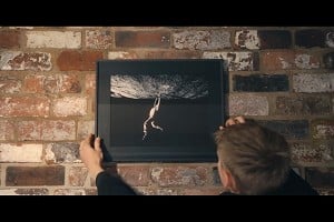

Fri Night Vid Finding Focus - Life Behind The Lens of a Climbing Photographer
This week's Friday Night Video is a portrait of a prolific climbing photographer from Wedge Climbing. Sam Pratt is well known in both the outdoor and competition scene but if you haven't heard of him, you've likely seen...

