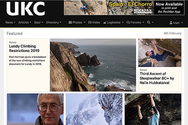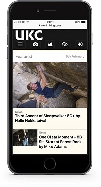
We are very pleased to announce a major change to the UKC and UKH web sites. Work has been ongoing for several months and the aim was to create a more modern-looking site that reflects changes in browsing habits, with a particular focus on mobile device functionality.

As you can see the site has significantly more space, which gives it a less cluttered feel than the old site. Behind this are many other changes detailed below.

The work is ongoing and, despite our beta testing for the last week or so, we expect there to be a few teething problems. Please use this feedback thread to report problems. We also welcome comments on what you think of the new layout and design.
The Main Changes
Homepage
The featured posts slider has been replaced with static cards (it never resized particularly well for mobiles).
We are displaying more news and articles and the Weekly Top Photos shows more content (on bigger screens).
We have added a couple of layout switches at the base of the page to allow you to choose your browsing mode. Light mode reverses the header to black on white, and night mode darkens everything to make it more pleasant in low light.
News Page
There is an updated layout for the News homepage and you can now filter news by activity similar to the way the gear pages have worked for a while.
The competitions page now lists competitions you have entered differently to those you haven't.
Articles
There is an updated layout for Articles homepage.
and Digital Features has a new index page that lists them by series.
Gear
The Gear pages have been using the new layout for a few months now so there are only incremental changes here, but it does now include product videos on the Gear homepage.
The Brand pages have been expanded and these link to the sponsored athlete pages and the Directory listings.
Forums
The forums have been given a bit more space and their appearance on tablets and phones improved. We have also changed the icons a bit to look a lot better and a few have been changed slightly like the pub which has gone from a tankard with unspecified green liquid, to a pint glass of the finest pale ale.
Directory
The Directory section has pretty big changes. The search page has been updated and the individual listings pages are a lot more extensive. You can now favourite certain listings so that they always appear on these pages. We will be adding a lot to the functionality of these pages in future.
Photos
The popup image viewer to enlarge thumbnail images (used on News, Articles, Gear and Photos) has been reworked and is a lot better on mobiles now. You will be able to comment and vote from an image popup in the future but it's not quite ready yet.
The Logbook pages are unchanged since they had been formatted in the new style over a year ago.


Comments
Much cleaner, really like it!
Looks amazing. Much nicer feel to it...... well done guys
OS X Yosemite 10.10.5 and Google
I have the same problem as others have reported: no forum icons visible.
Microsoft Edge browser, can't switch back to "day mode"
I'm going to add a workaround for old versions of Safari that can't render SVG images.